1.) BBFC - otherwise known as "British Board of Film Censors" is responsible for the certification of films, to see if that they meet the agreed conducts for the audience, and to classify them e.g. PG 16, 12A etc.
2.) A film is refined by a series of processes, responsible by an examiner, whether it'd be specializing in games or movies. Normally an examiner would watch and analyze DVD's on their own, which is called to be "solo-viewing", however bigger institutions offer bigger attention, therefore cinema films require rating in teams of two. These examiners take into factors such as mainly: general context (plot, character etc), cinematography and language; sex; drugs etc.
3.) When BBFC undergoes classifying films, lots of issues will undoubtedly occur, and problems will conflict from criminal offences; law to discrimination and imitable behavior etc. What the next step will occur is to then look at things from the film's perspective, e.g. mildly sexual innuendos etc, but taking into an account for example that it was in a kid's 12A film would then obviously mean that it is absolutely inappropriate, therefore should have action taken.
4.) BBFC's reward to labeling The Dark Knight as a 12A certified film would probably have been controversial when just looking at the conventions of the movie alone, such as violence that wouldn't seem appropriate for 12+, at all. However taking into account the origin of the plot and characters- Batman who comes from DC - a comic company which would appeal to kids, hence the movie should do so too in some respect, but not all. So my honest opinion would be that BBFC did rightfully certify it as a 12A, knowing that it is a 21st century movie, and that our generation of kids are more accustomed to the violent nature of things, therefore it is a win-win for both the film's hits and for the wider range of audience it offers by doing this.
5.) The guidelines for a 15 certificate are an even and mild share of the following:
strong violence
frequent strong language
sexual activity
verbal references to sex
sexual nudity
discriminatory language or behavior
drug taking
6.) Attack The Block - Classified by BBFC as to be 15 uncut, probably due to the fact that it is a sub/hybrid genre of comedy, mixed with horror AND science-fiction - a very unusual and bizarre genres put together, and maybe this appeals to teenagers of our generation, who have unconventional views and like a mix of things.
Friday, 11 December 2015
MM52:
2.) Capitalist views from the Hunger Games
Tuesday, 8 December 2015
Arthouse film institution research:
Production: Independent film studios:
1.)
Donnie Darko was produced by the studio, Flower Films- an American production company founded in 1995 that produces films and television programs.
The Falling was produced by both British Film Institute and BBC Films - both being very successful companies in the British film world.
Eternal Sunshine of the Spotless Mind was produced by Anonymous Content and This is That. 'This is That' has grossed over 21 films.
Appropriate Behaviour was produced by Parkville Pictures - an award-winning and BAFTA-nominated independent UK film production company based in London.
Let the Right One in was actually interestingly produced by two companies from different countries - Sandrew Metronome from Sweden and Magnet Releasing from the US.
2.) The studio has produced other notable films such as: Charlie's Angels, Charlie's Angels: Full Throttle, 50 First Dates and more.
3.) Though a $93 million dollars budget that went into Charlie's Angels wasn't necessarily "low" at all, it is still one of the most successful films to Flower Films, having $264.1 million in just box-office. On the other hand, the lowest budget film from Flowers Films would be Whip It - almost a quarter of the budget that went into Charlie's Angels. The low budget did however reflect to its appeal, having only $16,633,035 in box-office.
Distribution: Independent film distributors:
1. and 2.) The 10 steps of a film distribution:
The film production stage:
Producers, directors and screenwriters begin planning the production
Production finance and crew are finalized so that the production can actually start of the film can actually start i.e. filming
Filming starts off, whether it'd be in a studio or on a location, then once all necessary footage is shot is when editing comes in
2, 3,4 and 5.)
The distribution stage:
Once production of the film has finished, distributors have the role of how the film is going to be released, in other words - a strategy.
The distributors will then take legal action for screening the films within the cinemas
Distributors will then try to attract attention and create hype
6 and 7.)
The final distribution stage:
The film and disk, as well as the classification will be sent off to the cinema, prior a few days before it is premiered
The film runs for a fixed and agreed number of weeks, however can also increase if the demands are high
8.) The distributor lets BBFC to examine and certify that it meets all legal conducts for viewers in the cinema
3.)
Donnie Darko was distributed by Pandora Films and Newmarket Films
The Falling was distributed by Metrodome UK
Eternal Sunshine of the Spotless Mind was distributed by Focus Features
Appropriate Behavior was distributed by Gravitas Ventures
Let the Right One in was distributed by Artificial Eye
4.)
Donnie Darko has made quite a significant profit, taking note that it has the lowest budget out of all the films I analysed. It has a budget of $3.8 million and a box office of $7.6 million, resulting in profit of $4.2 million.
The Falling has unfortunately made a really unfortunate loss. Starting with a budget of £750,000 and box-office hit of £368,378, resulting in a loss of £381,622
Eternal Sunshine of the Spotless Mind has also made a huge profit, about three-quarters of it's starting budget of $20 million and then a box-office of $72.3 million, resulting in a profit of $52.3 million
Let the Right One in has made the most profit, taking into account its low-budget of $4.5 million and box-office of $ 11,227.336 , resulting in a profit of $6727336.
5.) Curzon Artificial Eye is an English, British film distributor that is most significant compared to other distributors, given that it focuses on foreign-language films and art-house films in cinemas. The distributor allows opportunities of low-budget and art-house films to gain reputation, and is a hive of entertainment for film critics. It's high standard and quality of films that appeals to the art-house film audiences has reflected and is evident witht he directors that the company has worked with. The company has worked with (which is known to be one of the best directors in the world) Michael Haneke, Lars von Trier, Abbas Kiarostami and Andrei Tarkovsky.
6.) Ice and the Sky trailer:
This film trailer has allowed me to learn and use different types of sound effects that are non-diegetic, such as whooshes that add suspense and give an epic feeling that sutures the audience, as well as different formats of video such as for e.g. the 4:8 ratio, giving off the old, vintage conventions. The film has also noted to have great cinematography from different angles.
Mia Madre trailer:
Mia Madre has exceptional cinematography too, especially the panning for a nice, subtle attention. Same as before with Ice and the Sky, non-diegetic sounds such as the muffled song in the background can help suture the audience and ultimately create an intentional emotion that is parallel to the clip.
Kiss of the Spider Woman trailer:
Like all of the previous cinematography shown in Mia Madre and Ice and the Sky, Kiss of the Spider Woman has exceptional use of it too. One thing to take note and definitely use in my film would be the slow panning on a clip of a character's facial expression, just to emphasize and add effect to it. Editing wise, cross fade transitions also allow for a nice effect, a sort of gloomy feeling that would maybe suitable for a memory or flashback.
Exhibition: Arthouse cinemas:
1.) The arthouse cinema I have chosen is ironically the Electric Cinema, based in London. The arthouse cinema is located in Notting Hill and Birmingham, London and is one of the oldest working cinemas in the country.
2.) The cinema screens both mainstream and arthouse films, and their programmes differ from major cinemas i.e. Vue because it gives films that are low-budget and the art of film aspects more appreciation, also raises a company's opportunity. It seems that major cinemas only care for making money, whereas arthouse genuinely want to embrace film arts. Films on this week in the Electric Cinema are: Bridge of Spies, Carol, The Dressmaker and Black Mass.
3.) The audience would most likely be aspiring filmakers, possibly because (as said before) arthouse films have more appreciation and professionalism in the filming aspect, so this then means they can be more innovative and be inspired.
A case study in independent film production: Film London and Microwave Film:
1.) Film London is UK#s public agency for films and media. The appreciation of arthouse films is also evident because the agency/organisation is for non-profit. Film London's ultimate goal is to promote and develop film culture. It exists as the very foundation for uprising films, directors, etc.
2.) Microwave Film is a low-budget film fund that was raised in 2006, and the goal is to simply shoot a full-length feature film with a limit of £100,000 - it is ultimately open for aspiring film makers, film makers in documentaries, fiction, animation etc.
3.) London Calling is a film-funding project that is open to the pupils in London. London Calling also provides support such as training and mentoring - a great way for aspiring film makers to reach to the top, professional roles in the film industry. It's main goal is to basically find talented film makers. It encourages film making because the project essentially provides each team with everything they need, and all they need from themselves are their ideas, visions etc for a film.
4.)
Borrowed Time trailer:
Borrowed Time fits in very well for an arthouse and independent film because it's plot doesn't consist of something bizarre or completely alien to the real world like in mainstream movies, but it has realistic views of the real world, instead, and has attachments to some people in London as it might be a reflection to their own selves, given that it is about urban youth. Therefore target audience would most likely be for young, London teenagers.
iLL Manors trailer:
iLL Manors, similar to Borrowed Time again revolves around the urban youth lifestyle of young, ghetto Londoners. The arthouse film is ideal as the plot sort of goes into the deeper side of gangs, drugs, violence etc. What we normally see of ghetto, money-deprived "chavs" to say is taken further, and therefore appeals again to teenagers, maybe even adults too, given maybe that they are fascinated by these kind of people.
Mum & Dad trailer:
Mum & Dad - a very sinister movie, particularly appealing to arthouse and independent films as it causes paranoia to whether the grim and grotesque plot could well and truly be one of your own and happen to you, seeing as it is realistic. It explores the story and truly creates a frightening story that sutures the audience in, which is why it fits into arthouse, but steers away from mainstream movies.
3 Tips for film production:
Allow change - representation - conventional themes, mixed with the actual reality of things will cause incremental change and has an effect on the audience watching the movie, rather than just for entertainment
Don't avoid little problems - things like too many characters, budget etc, little things can cause a huge problem in the end once you actually start production or half-way, so it is important to have an organized and good foundation
Have realistic expectations - we're not working with professional, Hollywood standard equipment, so take all resources and put good use
Friday, 4 December 2015
The Falling's clip starts off with a close-up and slight panning of a bruise, presumably from the young girl, given that her mis-en-scene reveals about her rough character from the shadowed eyes, almost no make-up, hence her tomboyish outlook and ultimately giving hints that she is the protagonist. A then panning shot to the right is seen, then suddenly a straight-cut to a completely, unexpected sex scene which may be some sort of a link to her, but not to the audience which then raises enigma codes and curiosity to what the clip meant. The clip also seems absolutely contrapuntal to the mood that was initially set, but then the bizarre and abrupt sex scene of course did otherwise, and the director of this art house film has definitely done good so in playing around with the emotions. Furthermore is then a straight cut to a medium-close up camera shot after the sex scene. The medium-close up I think emphasizes on the protagonist's facial expression, and so we can see her staring blankly, meaning that the previous clip was some sort of a memory/flashback to her. To support this then is a very fast paced series of images, demonstrating a montage of again her memories. Something noteworthy to add about the montage is that it also shows a stuttering flicker to perhaps show some sort of corruptness, loss of memory too? The transition then leads to the end of her school time, where a slow panning from the school bell leads to the medium shot of the school exit. The school's student crowd also adds more realism to the scene, to then again a slow 180 degrees slow panning, then to a long shot and straight cut of someone waiting. Researching the film's main target audience, it has no specific set of people according to the director, Carol Morley, and that the film has "lots of accessible ideas" so it's really hard to pin down an exact group, but it's safe to say that it appeals to all ages of people.
Donnie Darko starts off with contrapuntal sounds of a soothing, calm music that is played over the protagonist's past memory, along with the use of straight cut to suture people into the mood, to keep attention. Perhaps this was to reflect the happy memories the protagonist once had, so it would only make sense to add music that also reflected it. Camera movements from the cinematography are also very hard to spot, almost unnoticeable. We see a very, very slow camera movement that focuses onto the boy, also significant because it applies to the boy only, again evident of why he is the protagonist. Noteworthy is also the correlation between the level of how much the camera is zoomed in, to the importance of their dialogue - perhaps this is to show a clear view of emotions that each person gives from the medium-closeup. Similar to this is also the straight cut to a medium shot that shows both the therapist and the boy, this sort of breaks the tension as the protagonist delivers a significant and iconic line in the film. Then straight after returns to the medium-closeup to bring all attention back again. Reverse shots then play a part, back and forth.The 180 degree rule was also obviously well done, we can see a very deep-rooted conversation between the two characters, yet still keep attention, which the director of Donnie Darko has done very well so in doing. The mis-en-scene and lighting has also been appropriately used. Casual clothing, along with the location set in the house, with low-key lighting to add realism totals up a perfect scene that involves a therapist/psychiatrist - a scene that would normally associate with the real world. The age range would be around teenagers, about 16+, mostly because the plot is something that includes phenomenons, superstition etc on a scientific basis, but some viewers may not even be aware of this.
Eternal Sunshine of the Spotless Mind has great use of cinematography to add realism to the film. In the first few seconds we already see both variations of panning and tilting, almost as if its a hand held camera to then a straight cut, using the 180 degree rule properly. Tracking shots then emerge, adding realism to the cinematography as there are shakes that resemble e.g. someone walking - this sort of allows the audience as if they are the ones that peak through the bookshelves and follow around the two characters. The mis-ens-scene for the girl is also an easy answer to who's the protagonist. Someone with bizarre clothing, red hair etc, a goth type look would obviously look the unusual, hence special type. Reverse shots are almost avoided while there is a tracking shot ongoing, instead it moves from one of the character's view (steadicam) to the other from tracking shots, again. Noticeable is also just the use of medium shots, from torso to face, it keeps a balance for both the facial expressions - an important role, especially in Romance genre movies like this, and the body language. The target audience could be either teenager or adults, so probably a mix between the two would be a more likely option. I'd say teenager at first because they're known to be appealed by drama, hence Romance, too.
Appropriate Behaviour. Straight from the beginning we hear a sound bridge, of a medium-ish long shotof the outside store to then a straight cut that leads to the actual scene. This gives the character subjectivity, e.g. store, hence shopping. It stresses the connection between the two scenes. With this being said, lots of medium shotvariations are demonstrated, maybe for realistic reasons e.g. there just isn't enough space in the shop. We can also see a very slight shake, as well as slight tracking shots too, and this allows to shoot a scene all in one take while undergoing a medium shot, which makes it almost unnoticeable for the audience. However if close ups were used, so willreverse shots have to be used too, continuously, although it does allow a clear view of each character's facial expressions. Diegetic soundssuch as the store's music also play during the entire clip scene, but it it almost unnoticeable, however it does set some kind of mood. Also significant is that the clip scene avoids silence, perhaps to avoid an awkward, tense mood, and that the music also loudens a tiny bit when there is no dialogue. Target audience would most likely be young adults, knowing that Appropriate Behaviour is a mix between romance, drama and comedy, and this mix of genres usually have a plot that appeals to young adults, maybe even teenagers.
Let the Right One In - a vampire film, starts off with diegetic sound of the radio that would seem contrapuntal to a potential death scene that is about to occur, It messes with the emotion and confusion is caused. The mis-en-scene of the three gangster characters also show blatant invasion in the swimming pool area. They wear outdoor, casual clothing which would seem unusual in a swimming pool, so we can establish that they're obviously here for another reason, but definitely not to swim. Cinematography also involves a tracking shot, focused on the eldest and antagonist perhaps? It sort of has a low angled crane shot, which asserts his dominance and proceeds to take his jacket off, raising action codes that he is about to get down to business. Other action codes also add tension to the scene, such as when he unsheathes his knife. Other close ups of the villains also allow us to see a facial expression, example at around 1 minute and 53 seconds, we see a worried face, coming even from one of the villains would exaggerate how sinister and bad the situation is. We're also left with a shot of the boy holding his breath for about 25 seconds - it creates a tension as the seconds build up, not knowing whether he is still holding his breath or has died from drowning.
Let the Right One in shares a genre of both Romance and Horror, quite similar to the Twilight series. The target audience for this film would be wider than an ordinary horror. It's Swedish, so it appeals to a totally different segment than the traditional Western audience. The film would appear less to those who would revolt themselves in the grotesque, violent, gore scenes, hence why the "horror" in this movie is much more subtle, so perhaps the Romance is used to broaden the appeal.
Wednesday, 25 November 2015
MEST 2: BRIEF
1st prioritised topic:
Foreseen - Urban Life, genre - Casual man who has been affiliated with gang members in the past, and suddenly one day mercenaries sent and are from the gang are sent to kill him without discretion. Every opportunity to killing him is seized and potentially exposed by the public crowd. In his previous history, he has done wrong to notorious and powerful gangs, and now his family is at stake. Knowing his wanted status among killers, he aims to remain anonymous in public and seeks help from family, friends and the police.
Group: Darnell, Lele
Thursday, 19 November 2015
Preliminary exercise evaluation:
While working in a group, our initial thoughts of a film that includes exchanging dialogues and sitting on a chair opposite of another character would easily spring to mind of an interrogation plot film, and that's exactly the idea we went with. Our brief plot consists of a company scientist that is minding his own business, but what we don't know is that his past history has affiliations with gang members, and it has ultimately caused a stir.
Regarding the criteria, dialogue obviously didn't have anything specific to be aimed towards, so the script was an easy area to work on. However the shotlist and storyboard came in more useful as it helped organize and break each scene into detailed segments.
My role in the group was to plan out the shotlist and edit the film. Our strengths in our film I think was the lighting - using a darkly lit room for a silhouette effect was very conventional and fitting for a mysterious interrogator. More conveniently was also the well ventilated area, allowing no static or any other disturbances of sounds that a microphone can easily pick up. Shots wise, we came up with a number of different camera angles, from side, to front, to back. We also used an over-the-shoulder shot which allowed us to do lots of reverse shots from different angles. Editing wise, non-diegtic sounds of a somewhat happy music that you wouldn't normally associate in an interrogation film was used, just to create a juxtaposition, a sudden strong contrast as a kidnap interrogation is probably not what the audience were expecting. The colour correction used was also supporting this effect as it was very bright in the beginning, but once the kidnap scene had started a very dark, greenish colour would be instead applied. Effects such as the shakes and distortions made were used to suture the audience while viewing a POV shot to ultimately make as if the audience was the victim himself. In addition too, the dialogue sounds were modified to create a more muffled and deep sound in order to again, make it more mysterious for the antagonist. We were also able to wrap up the production in a very short amount of time - about 45 minutes to record and 30 mins to edit, however the short time did kind of reflect its finished quality.
Our weaknesses as said shortly before were primarily from lack of organisation and communication it seems. People were needed in inconvenient times and this ultimately forced us to rush the whole production, and also because it underwent during lesson times, some rooms that we initially wanted were in use. I also personally think that the dialogue and acting needed improvement on my behalf as in my eyes it sort of let down the ending and the climax of suspense. Another thing to add while in production is to also not expect literally what you see in the preview playback, a problem we faced was that in the preview, lights were completely in level, not too dark or not too light, but when it actually came to editing the video, it turned out to be way darker and didn't define the silhouette effect much.
Preliminary exercise evaluation:
Tuesday, 17 November 2015
preliminary task:
Tuesday, 10 November 2015
· - Medium-long
shot from behind of laboratory worker walking
· - Close-up
of peaking kidnapper’s face
· -Reverse
shot, medium shot of laboratory worker walking, again
· -Medium-close
up, camera in front of worker’s face, tracking shot
· -Low-angled-long
shot on kidnapper dragging the worker’s body
· -Sudden
close-up of kidnapped person in a dark room -POV shot of kidnapped person
Sunday, 1 November 2015
MEDIA AWARDS HOMEWORK TASK:
My first, favorite Y12 film choice would be 'The Experiment' because I think it covers all elements of film making that we've learnt in AS-Media.
The short typography that we see in the beginning made the film seem more professional to me, as well as the Channel 4 intro. Editing was also done well, the buzzing tv simulator transition was well fit for the genre of the film, and ultimately complemented it. Continuity editing was also obviously demonstrated, and the montage of the character's childhood and happy memories, combined with the straight cuts to danger (her being chased) I think creates a significant contrast between the two and an overall good effect and use of editing.
Cinematography was also well used. Both variations of panning and tilting of the camera were used appropriately to create suspense and pace. Long-shots were also used effectively to give us an impression of the setting, such as the skyscrapers, denoting that it is a city. POV shots with some shaking were also fit perfectly to make things more realistic, we see this when the character enters her abandoned house. The tracking shot focused on the running was also very well executed, because it maintained and sustained the shaking and stabilized it, with keeping up with the speed which was impressive.
Sounds were also very effective in particular scenes. Non-diegetic and parallel sounds emerged such as eerie music and the narrative coming from the character herself, on top of clips of her being chased. These elements put together have created a building up of pace and suspense. Also to mention the muffled effect applied to the assassin's walkie talkie was great, and sets with the conventions of a murder/kidnapping scene.
The mis-es-scenewas also very well fitting. Wearing a tracksuit with a backpack was conventionally right for someone escaping, running away from the murderer/kidnapper.
Overall a really good film, and criteria wise, excellent.
My second Y12 film choice would be 'Labrat'. I really liked the camera work of close-ups and medium shots of the landscape, that consisted of grass and tree branches. The narrative was also very linear - story was not complicated and was understandable. The mis-en-scene was greatly demonstrated, for example hoodies to connote something anonymous, and the makeup bruises were remarkable too, and again making the film more impressive in the costume department.
Sounds were also parallel to each appropriate clip we see, in the beginning we hear the diegetic sounds of chittering birds during closeups/medium shots of the outside nature landscape. Then non-diegetic music played over each clip that were shown to be the character's encanting of potions, and works well with the cinematography to create a nice aesthetic, and sutures the audience.
Moreover extreme closeups of some sort of gooey, unknown substance used in the character's experiments may rise some enigma codes to whether the things the character is mixing are dangerous or recreational - it questions whether the labrat is a mad scientist.
An overall excellent film, but more impressively exceptional with the cinematic towards the end.
What Makes a Good Practical Production:
I think the main appeal to the audience would be the visual aspect of films, probably because conventionally to a normal viewer, it's all that matters and interests them at first glance. However art house cinema audiences would be the exact opposite - they would look at films more with more knowledge about them, and with a more appreciative understanding of a film maker's work. With this said, generally a good practical production should have: good editing, good story that makes sense, very aesthetically pleasing cinematography, good dialogue, and sound and music - all these factors are really effective in suturing the audience to the film, making them really engaged and interested to follow on. Narratives on the other hand play a bigger part in films, in my opinion. Narratives should always be very interesting, because for example if one scene of it is boring, and it disinterests the viewer, so will the next scenes by assumption (as thought by the viewer), so it is very vital to keep all attention awake. Another more important factor would also be the mis-en-scene. Having a sword fight with a wooden sword and aluminium wrapped around it, or a gun fight with a Nerf toy gun would be ridiculous.
Media Awards homework task:
My two favorite Y12 productions:
Thursday, 15 October 2015
Editing analysis:
Right from the start, we see a sound bridge from the voice of a reporter, as well as a demonstration of a tracking shot to perhaps fit the conventional reporting scenes in news, more evident by the chanting of protesters.
Continuity editing also plays a part in the next scene, when a squad of armed police officers discuss something, as well as the result of an action code from the cocking-back of a gun - the implication here suggests a violent scene is about to occur, and that is what exactly happens shortly after. The next scene follows the same group of police officers, followed by a straight cut transition to accustom and divert all attention to the following shootout scene. However what is most significant is that as the audience, we expected the scene to only be showcasing their way to the area, however the killing starts halfway as they make their journey, which conjures up surprises early, and a sudden build-up of pace which is very effective. All sorts of diegetic sounds also start, we hear the penetration of bullets against cars, windows, dumpsters etc, which also contributes to building up of the pace and action in just this scene.
All after the scene ends with an explosion, we are given a long shot of the aftermath, then immediately we jump back into the scene. Also something to acknowledge is the mixture of pans and tilts from the camera, it's almost as if a POV shot of someone running, and maybe this too complements and fits the right level of pace that we see. What's also remarkable is that there are absolutely no non-diegetic sounds, perhaps this is to make the scene seem more realistic. Also backtracking to what we explored earlier, at around 2 minutes and 43 seconds is also a very fast tracking shot of one police officer running from one road end, to another, and again this is allows simultaneous things going on in the screen, which ultimately leads back to the pace.
So far almost every frame lasts very short, there are straight cut transitions, after transitions, after transitions. However things vary as we progress into the clip. At around 3:34 we see a very bumpy, hence realistic tracking shot, BUT straight after that we see a long shot, high in the air - maybe this is a connotation to them being watched by hiding bandits, nonetheless it is still a very effective shot, especially in action genres and these types of scenes. Furthermore more into the clip, at 5 minutes and 35 seconds we see a tracking shot that revolves around the one enemy, and are therefore given both perspectives between the binary oppositions. It also in my opinion makes the audience sutured to all action, as well as ultimately more to look on the screen. In addition shortly after that we see the constant frame changing of going back and forth between the enemy and a police officer, the significant thing here is that both are slowly getting closer to each, but not knowing, and perhaps this adds suspense as metaphorically speaking, the pace is a ticking time until the two clash.
Close-ups are also used most significantly and greatly in the end after the shooting ends. At 8 minutes we are able to see a officer's facial expression, then a straight cut to then a medium shot from different angles, left and right to adjunct the gruesome aftermath, as well as to explain her expression. This is further demonstrated when we see a panning and tilt of just the dead bodies, then slowly tilting, leading to the other officer's facial expression and shock.
Tuesday, 13 October 2015
Excluding the trailer introduction till 1 minutes and 20 seconds. The opening scene to The Matrix (1998) starts off with a basic, yet very significant vertigo effect is reached, although contextually speaking it has no relevance to any types of shots, it is a great use for the transitioning which we see into the front, circle of a torch.
In addition to this we also see a closeup of a police officer, we are emphasized to see him squinting (due to the closeup), and therefore we know that the abandoned hallway is very narrow, very dark too, hence the the torchlight - this also tells us the mystery of what danger lurks in the shadows, and therefore creates suspense.
We then see the panning of the camera to the audience's right, while slowly losing focus on the first police officer we saw earlier, to showing the rest of the squad. Similarly a panning shot then occurs when another officer takes the lead, we then see a medium shot that is angled low from his back, this is to showcase and demonstrate the very unfamiliar nature of the setting - the crane shot here is demonstrated.
Later on we then see a Steadicam sequence projected behind the police officers, also creating a silhouette and almost a POV shot. Likewise then a panning shot that movies to the left in order to have a better view of the door as all attention is diverted towards what is behind the door, so it then again creates suspense while completely not acknowledging everything else in the background as we did earlier. A breach of the door then sends constant camera panning from left to right to increase pace, while then flashing of lights from all directions also complements this. Finally then a tilt from a desk going upwards slowly reveals which we presume to be the protagonist or antagonist's face.
Tuesday, 6 October 2015
WWW: I have carefully explained each picture with relevant details, as well as making it short and snappy so it didn't get boring, hence avoiding from people not paying attention to some significant things I might have said.I also think both contrapuntal and parallel slides in the collage are fit for their theme, i.e. a dark bloody background for something sinister and depressing, while green fields and cartoons for the complete opposite.
EBI: Presentation wise I think I could stare less at the board, so I can project my voice and make it clearer to the audience. I probably could have also picked a better example for my background music too.
Best 3 presentations for me:
Amrit -
Very well explained correlation between picture and music, as well as keywords with good vocabulary.
Mamduh -
Very interesting layout of pictures and what it connotes to the music chosen.
Abayomi -
Fluent speaking and straight to the point.
The Hunger Games clip includes a variety of both diegetic and non-diegetic sounds. Diegetic would presumably of course be the natural sounds, however what is significant is the travelling sound effect of the arrow - the swoosh makes it that much more "aesthetically pleasing", and simply appealing to the ear. Similar to the suspense is the quiet audience, combined with the cocking back of the arrow which is for the build-up of climax, until the arrow is fired, which releases it.
On the other hand, we see a non-diegetic sound - the eerie and spookish music that starts around 35 seconds in the clip, and again also ultimately adding suspense. I would like to think that the music is also parallel to the clip, acknowledging the dark room full of spectators is probably evident of it. Also remarkably during the end of her shot, the music is less mellow and muffled, hence a higher pitch to perhaps unsettle the audience, and therefore again release a sea of built of suspense. Dialogue wise there wasn't any plausible effect, however conversations that have no relevance to Katniss may connote to the audience that she is somehow going to divert their attention, knowing her, and that is what she exactly does. When the sudden chattering of people is silenced by Katniss' arrow being shot dangerously close to them is a notable effect too.
The first film: ‘Blade Runner’ by Harrison Ford I
think is about intergalactic warfare, simply by looking at it, at first gander
I can already spot what seems to be the rear end of some form of a spaceship.
Both antagonists in the cover are also displayed in opposite ways; for example
on the left side, we see the male character against a ray of light, possibly connoting it as a
metaphor for a hero and someone who enlights. Completely in contrast is what is to the right. We
surprisingly see a female, smoking – this is similar to the lore in typically film noire genre films,
where the female or feme fatale in French seduces men, and ends up killing
them. Her background in the cover is also pitch black, again completely
opposite to what the hero has, so we can evidently say that she is the enemy in
Blade Runner. The genre I think is confidently to be Sci-Fi because its conventions consist of
futuristic Nano technology, which we can refer to as the spaceship. Likewise
futuristic and obscure settings, such as outer- space which we also see. The
target audience may be highly likely to be young adults who are curious, so
mostly
likely in my opinion to be ages ranging from 20-39. In addition the
whole ideology of aliens became popular in the 1980’s from sightings of UFO’s,
and the movie was released 2 years after the uprising of it, so then also came
the popularity of the movie.
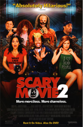
The second film: ‘Scary Movie 2’ was kind of
confusing to see what the plot was about. Typically in horror movies we have a
murderer and a bunch of people obliviously dying, however also acknowledging
that this is part comedy, part horror things may be different. So a murder film
with a few hilarious deaths. The font of the movie title doesn’t look scary or
intimidating at all, in fact it is a blatant giveaway of a comedy movie. The
facial expression of people in the cover also doesn’tdenoteany emotions involving being
horrified, petrified, terrified etc. And the fact that the setting in the cover
is in ironically a cinema, it is just another factor to why “Scary” Movie 2
isn’t entirely scary, at all. The target audience may be young adults, ranging
from ages 20-39, predominantly because as a horror movie, some scenes may be
frightening for younger people, but I think the comedy side of it makes it
neutral. So the age ranging for this movie is something to be very pessimistic
about in opinion, however according to the movie the appropriate age is for
16+.
The third film:
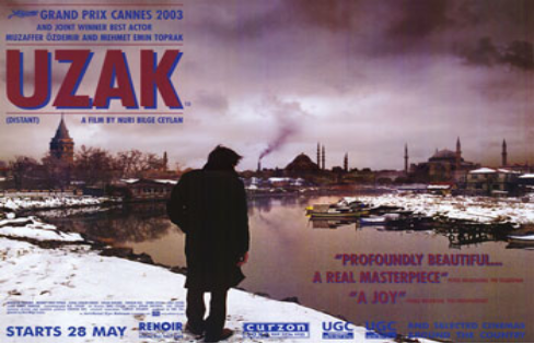
‘UZAK’ from an initial look, looks like a setting of a rundown place,
possibly from war, and in fact the place is Turkey. So taking into
consideration of the location it could most likely be from war, plus things
like bombs and gunshots are only capable of that kind of destruction. So maybe
the plot is about a refugee (as we see on the cover) that has fled from their
country due to war, and then comes back to see the horrifying aftermath. I
think the genre belongs to thriller, because we associate war with violence so
there may be some graphic scenes in the movie. The target audience I think are
adults of 18+ because I think the movie demonstrates more about the agenda of
war, rather than just a cool action film which teenagers will look for.
The fourth film: ‘I’m Not Scared’ I think is
about a group of children that find a hole, or something interesting in a cave,
and because they are so fascinated by their discovery they dare one another to
go in there to find out, so then came the title "I'm Not Scared" to go see whats inside. The genre may range between thriller and action, because the colours inside the font what appears to maybe be flames, and maybe a hole to hell? The taglines comments on the left and right also makes the film to be less sinister and thrilling due to the font. Conclusively a movie for ages of 13+ which I think is a fair estimate.
The fifth film: 'Sin City' I think includes a story line involving gang related violence, simply from the word 'City' where gangs are fighting for a living; to survive. It links to a contextual point when in the late 90's in places like suburban, ghetto areas where you either had to be affiliated with a gang, or die - there was no choice but to be cynical. In fact some cities were so violent that formerly known city Chicago is now known as 'Chiraq'. The genre I think belongs to the action and thriller category, because we can obviously relate something intense involving guns, and the same for action. The colour choice of just black also signifies a very dark mood, also not to mention the pitch red font which could again connote blood i.e. gang violence. Conclusively a film for ages of 18+.
The sixth film : 'Pirates of the Caribbean: Dead Man's chest' is an easy plot to find out in my opinion, because the whole story is pretty much in the cover. Typically expect a pirate that is looking for an ancient, hidden chest i.e "Dead" man's chest, and clashes with another pirate gang while obviously encountering problems like a giant sea monster as we see in the middle of the cover. The man in the middle and woman on the right possibly are also heading home, while stranded on an island, and kept hostage by village people like we see on the bottom left. The genre is a pick between Fantasy because of a giant sea monster octupus/squid, or Adventure. Age rating would probably be 13+ purely because I see nothing that is threatening, or giving a sinister impression from the cover. Plus it involves pirates which is always funny.
The seventh film 'Bride & Prejudice' I think is about a man that is in love with an Indian bride, however his stereotype of Asian parents that oppress the cultural Indian weddings is a bit too much for his needs, and controversy arises. Hence the prejudice as the husband, and just the bridge. We also see in the far distant right corner of the Taj Mahal - maybe a hint of the agriculture as it is a symbol of India's rich history. Conclusively foreign love that crashes - a domestic tragedy. Also to mention the tagline "Romantic, funny" is a blatant hint of the genre being Romantic and Comedy. Nothing explicit in the movie, except maybe a few sex scenes as the tagline goes "so sexy", so maybe 16+.
The last film (finally) 'Million Dollar Baby' looks to be possibly a novice athlete that progressively gains ranks amongst the top tier counterparts in the sport. Straight away the main antagonist we presume to be (the girl) due to a main focus on, is seen to be very masculine - completely contradicting what we typically expect from a feminine aesthetic. The pitch black dark background colors also connote a very blank, very serious story where there is no cheating, no boosts, just pure hardwork and dedication to become top. Maybe a good inspirational and motivational movie for the audience in the Drama genre. For ages 14+
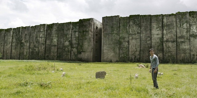
MAZE RUNNER - MISE-EN-SCENE
The beginning scene, about 20 minutes in we already see key conventions that make it a thriller/adventure film. First off we already see the dystopian setting - a dome/maze that is around 70 feet tall which is an intimidating figure. Also to mention the weeds that grow out and between the boulders, perhaps an easy hint that people have been stuck in the maze for quite some time; as well was the dirty texture. The cage like maze also connotes an isolating emotion, that hope is very little in escaping - this is more evident in Thomas' (antagonist) facial expression and body language. He seems to turn around, perhaps from astonishment upon seeing the face of the maze, and to look for people's answers on how to get out. Or his hope is irredeemable, and he knows his grim destiny to die and rot, left speechless. The lighting of the sky is also very cloudy, this gives us the sense that everything is very dim, so is hope as people's faith in escaping slowly fades away, dimming. The green grass outside the maze looks to be very natural, almost as if the people trapped inside are like cows that feed on grass. Cinematography wise Thomas is placed to the right corner so that the view of the maze is more emphasized, and to wow the audience.
Hunger Games - "I volunteer as tribute!"
The Hunger Games is a dystopian city, where two areas are divided: the poor and the rich, also known as "The Capitol". The poor are under the penance of the rich and tyrannical citizens, and as punishment a male and female is picked randomly in a "reaping" to fight in an arena till the death, just for entertainment.
The setting is outside each homeland's districts, bordered by the Capitol's guards. The depressing ideology of being forced to fight, and if refused it will be enforced by guards is what already hints he audience of its twisted and wicked nature. More evidently, at around 1:47 of the clip is when the same effect settles in more, because we only have the Capitlist clapping, while all the peasants are put to silence, in dismay - a very bitter kind of sadness is shown here. Clothing as well plays a big factor in out blurring the isolation between rich and poor. Contextually speaking, Katniss' (antagonist) clothing is very typical of the working woman class, or maid. But on the other hand Effie (the Capitolist) is dressed in a rather bizarre style, so the contrast is an easy hint to spot. The makeup on Effie is also very immense, whereas Katniss barely has any, or if any, and perhaps nudges the audience to show how much difference there is in the social hierarchies.
Maze Runner: Scorch Trials - "Open this door!"
The setting is in a very hollow underground tunnel, while being corned by the guards, not to mention that they are armed with syringes at 3 seconds in, and the only way to escape is with an authentication ID card that possibly may OR may not work. Already the tension build up is rapidly, as well as the beeping sound which makes it that much more intimidating and seat gripping, almost like the sound is metaphorically a ticking time bomb. Their clothes are also very basic and typical because they are kept as hostages - not much is to say about them, except the fact they've been wearing the same ones for a couple of days, and probably need a shower. The most significant part is during the end, when the metal door is slowly closing, and Thomas' running pace increases, so does the audience's suspense. Facial expressions were obviously in dismay; in shock, but it is a genuine sign of their fear, and how much they want to escape the infantry.
Divergent - "Zip lining"
The setting is from a skyscraping building at night, while zip lining - pretty awesome. At 20 seconds in, we see from a POV of the audience, of the height difference from below the building, and is effective in creating a jumpy feeling as we travel in Beatrice's view as well. The time is also set at night, maybe to connote nocturnal creatures i.e. owls that soar through the air at night. Makeup isn't really necessary for Beatrice as she is an action-fighting character in the film - having said that she kind of has a tomboy vibe to her. The music in between the zip lining duration also sets pleasant mood, also not to mention the reflection we see of Beatrice at 45 seconds, then suddenly a stunning view after 3-5 seconds. Her facial expressions obviously seemed that she was genuinely enjoying her experience, The objects such as the abandoned building with a hole in it made it that much more immense for the audience too, at exactly 1:00 we see broken metal bars, placed and hanging randomly, and stirs up a suspense of emotion to the audience to whether she is going to crash there, or not. Same effect near the end too, when she has to pull her zip lining brakes, otherwise she will end up with a pretty, pretty bad face plant against a brick wall while going 60 miles per hour.
FILM LANGUAGE: LIGHTING
I strongly think the technique used here is low-key lighting, simply because there is a strong contrast of light and darkness between her partially lit right cheek, and the rest of her face, as well as the pitch black background. There is also back lighting, because to say that there is top lighting would be to say to emphasize on her face, and glamorize it which is not the case as a third of her face is flashed. The lighting effect creates and emphasizes on the smoke - this would be significant as typically it is shocking for a female to smoke, speaking contextually for the film's period. This then is a blatant connotation of the female being portrayed as a possibly devious, dissentient etc, or in other words a feme fatale.
This image is also low-key lighting, because there is again a strong contrast of pitch black and light on the woman's face. And obviously, it is also top lighting in order to accentuate the woman's face. The overall effect of the pitch black background is what opens the image for lots of various interpretations. For example, it could be the image of a horror film, because a dark room could connote something sinister pulling her, evident because we see two hands grasping her face, or it could just be her own hands. So overall the colour scheme just makes the picture more exciting, and gets the viewer thinking.
This image is purely high-key lighting, because the contrast between light and dark is less pronounced. Typically, we expect the background to be darker, however even it is drastically light, or even the same level of light reflecting on the person. It also seems that light is coming from all angles, because if it was backlighted the face would appear much, much darker than we see in the picture, and if it was top lighting his face would be the most visible. Conclusively it is a mixture of top-lighting and underlighting.
This image seems to have been a product of low-key lighting, because the light reflected on the left side of his face and to the right is very noticeable in contrast. This type of lighting is very complementary of it's dark theme, especially with the rain. The other lighting used seems to be top lighting - maybe the effect created by this is mysteriousness, because we only see part of his face. Also to add, the skyscrapers and buildings have been highlighted to maybe showcase the extent of his characters, as someone wearing a cloak, with a mangum, while in the rooftops is very obviously very suspicious.
This image at first glance is a strong hint of low-key lighting, particularly because shadows are created, hence why there is also back lighting used in this image. The back lighting has created a perfect shadow of her body, as well as illuminating the majority of her body. This effect allows to see the facial expression of a person, as well as the created shadow being common in horror movies, where the dramatic shadow figure shows body movement when for e.g. in a movie where a vampire attacks, and then the camera focuses out of the physical figure and instead shows the shadow.
This image is no doubt a product of high-key lighting. We see a very realistic image, where no purposeful angles of light are drawn in, just the natural light cutting through the blindfold curtains. Hence meaning it is hard to depict whether it is neither backlighting, underlight or toplighting. The overall effect is very natural and realistic, and very fitting for a romance movie.
This image has a blatant use of back-lighting, evident from the sharp light contrast, against the shadows formed from each figure. This also means it is obviously low-key lighting, because a silhouette is formed. The overall effect of appearances being covered by the lighting makes the picture much, much more mysterious. From what I see the four figures are either aliens or men, or astronauts, and this is what makes the use of back-lighting full of interpretations of people. Excitement and suspense is created.
At first glance the contrast between the light and shadow appeals the most, therefore low-key lighting is used here. There is also top-lighting coming from the left side, it allows us to see her facial expression, and is very significant and effective in horror movies. The dramatic shadow is also complementary of its genre.
In this image, light and dark are neutral therefore things are more pronounced and visible, meaning it is a product of high-key lighting. It also seems top lighting is used because light is directly shun to the person's face, evident by the shadows under the neck. Overall a realistic effect created, although in my opinion a dark background would be better, because it would look like for e.g. holy light shun upon the person that prays as light is more emphasized.
This image seems to be low-key lighting because the moonlight from outside depicts whether it is day or night. The contrast between the light and pitch dark is more pronounced too. Backlighting is also possibly used because his body is almost the same as the pitch black basement, due to the silhouette effect created. This is very effective because the two are complementary of its genre, and implies something sinister, and an overall scary atmosphere.
Prior to the other romantic genre image, this one is also high-key lighting because the levels of light and dark are neutral, again. This is very fitting for a romantic movie, because the conventions are very natural and realistic, hence meaning a realistic image needs to be created too in respect. The light also seems to be coming from the left, emphasizing more on the woman's shadow. Perhaps a connotation implying shadows are a dark, evil figure, hence a hint that she is a feme fatale.