MEST 2, Print Brief:
Photoshoot:
- The main characters are Malik, Lucas and Donald - they are of course going to appear in the front cover of the programme as the whole premise of the film revolves around those characters, specifically.
- Images needed on the contents page would be such as themes and conventions that link to the film's plot, so something like Malik, Lucas and Donald standing side to side of each other, or someone grabbing hold of the protagonist from behind, drawing a gun or knife.
- The double-paged spread will include images such as low-key lighting for a chiaroscuro effect, as well as the light facing back to where the protagonist, creating a silhouette effect, and ultimately raising lots of enigma for the reader.
- Shotlist:
- Medium-shot: Protagonist and antagonist beside each other, folding their arms
- Close up: Protagonist getting gripped from behind, shot type is to emphasize facial expression
- Medium-long shot: Protagonist getting chased by a gangster, showing full body of both
- Extreme close-up: Eyes of the protagonist with the iris/pupils displaying images of the situation
- Long shot: Showing silhouette effect, full body shot
Costume, props or make-up:
Costumes are going to be very straight forward for our film. We will be wearing things that follow young, gangster, British life, and conventionally speaking, this would mean things such as tracksuits, preferably from a sports brand. Caps may be used too, for enigma codes.
And props are:
- Handbag
- Toy gun
- Torch
- Cigarette
- Baseball bat
- Anything that substitutes a knife
Preparation for the Wednesday, 20th January, photo shoot:
Preparation obviously includes all those things mentioned above are agreed with the group, a final decision. Props wise, some of the things listed are still yet to be in our hands.
Research:
1.)

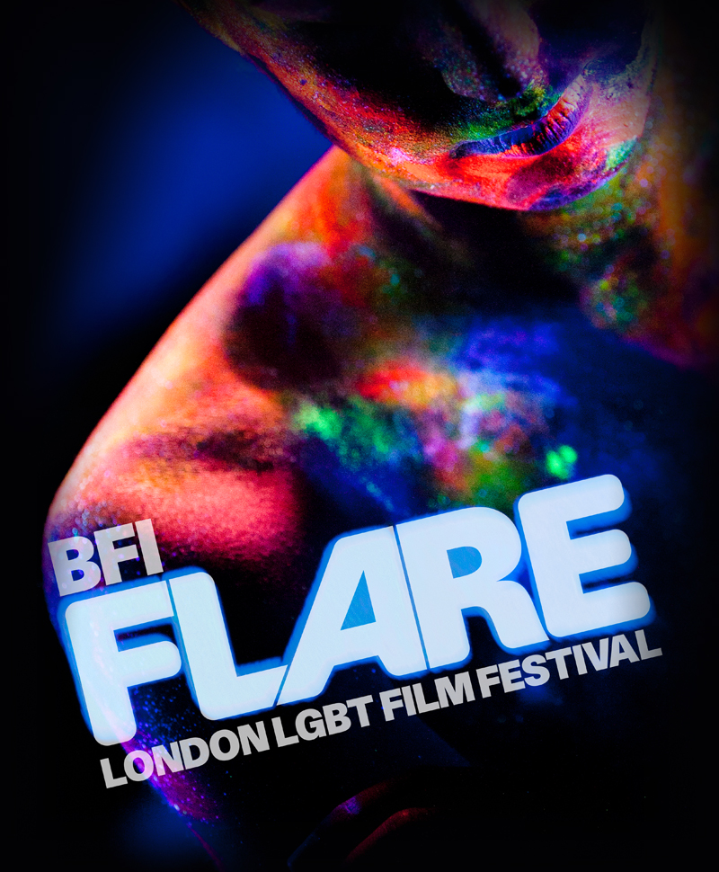
This BFI Film Festival programme front cover definitely includes:
- Title of publication - written in big, bold letters to state the programme. Made more appealing through the use of font colours, too.
- Colour scheme - as mentioned before, fonts have bright, vibrant colours that possibly look like fireworks, and this is very well fitting as we associate this with a "festival"
- Language - as mentioned on the convention notes, it is 'economical' because it states "in partnership with" "American Express". Very snappy too as it states it's business and it's business, only
- Date - states the film festival's date, and is clearly written
2.) 5 arts centre or cinema programmes/brochures:

This BFI brochure of 2015 definitely has experimented with the use of different colours a lot, and the color scheme is what they're usually known to use. However this brochure in particular from them has instead used models that has the colourful scheme applied, different to the usual text.

Another BFI brochure, but instead this is for horror movies. Obvious conventions such as the sinister, pitch black image background support it's genre. However the main thing I will be taking from this brochure is the sort of distorted, "drugged" vision (the gate), in order to emphasize it's unsettling and perhaps violent nature.

This film brochure has unusual conventions and an unusual colour scheme. It portrays a picture of a toy bear, wearing a bucket hat, and race-cars and race-bikes - there seems to be no connection between the two images, however it may just mean that there is a lot of variation in the festival. Perhaps I will take into account of this, and use collages of images from objects to places that have some sort of relevance or a motif to the film.
Straight from looking at this brochure, it has a very simple layout. It has a very straight forward message and purpose with the necessary details and nothing else. This means there is more space for images, and is also the perfect opportunity to have a meaningful, enigmatic, image on board. I will definitely take into consideration of this.

This brochure has a landscape layout, possibly making more room to the left or right, depending on the central image subject's position. This allows an organised set of information to be displayed, for example on this, the details, dates, programme name etc is all on the left.
3.) 5 contents pages from arts programmes or magazines:

This contents page is very well organised. The headlines/titles are all on the top, while all information is at the bottom. Font color schemes are also very fancy; it has a 3D rgb effect which holds very nice aesthetics and is ultimately attractive. The color schemes are also significant. Each the title, information and additional lines are coloured, according to what they present.

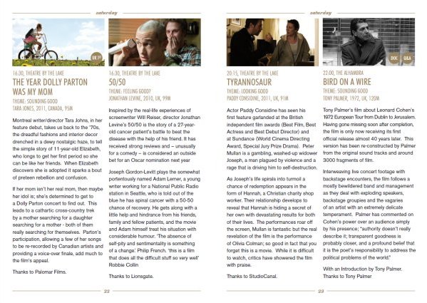
This brochure's content page is very well informative, as well as easy to navigate. Each film has its own image above all the information. It is an overall plain and simple contents page, just like the previous one. The brochure's simpleness of color schemes - white and black also emphasize on it's simplicity.
This contents page is very clear and concise, labeling each specific page number to each content and so forth. The font in particular has also been significantly made different to the others. It is very bold, red and big in size compared to the others. Colours of red also catch the attention of readers, so this is another reason why it's as concise.

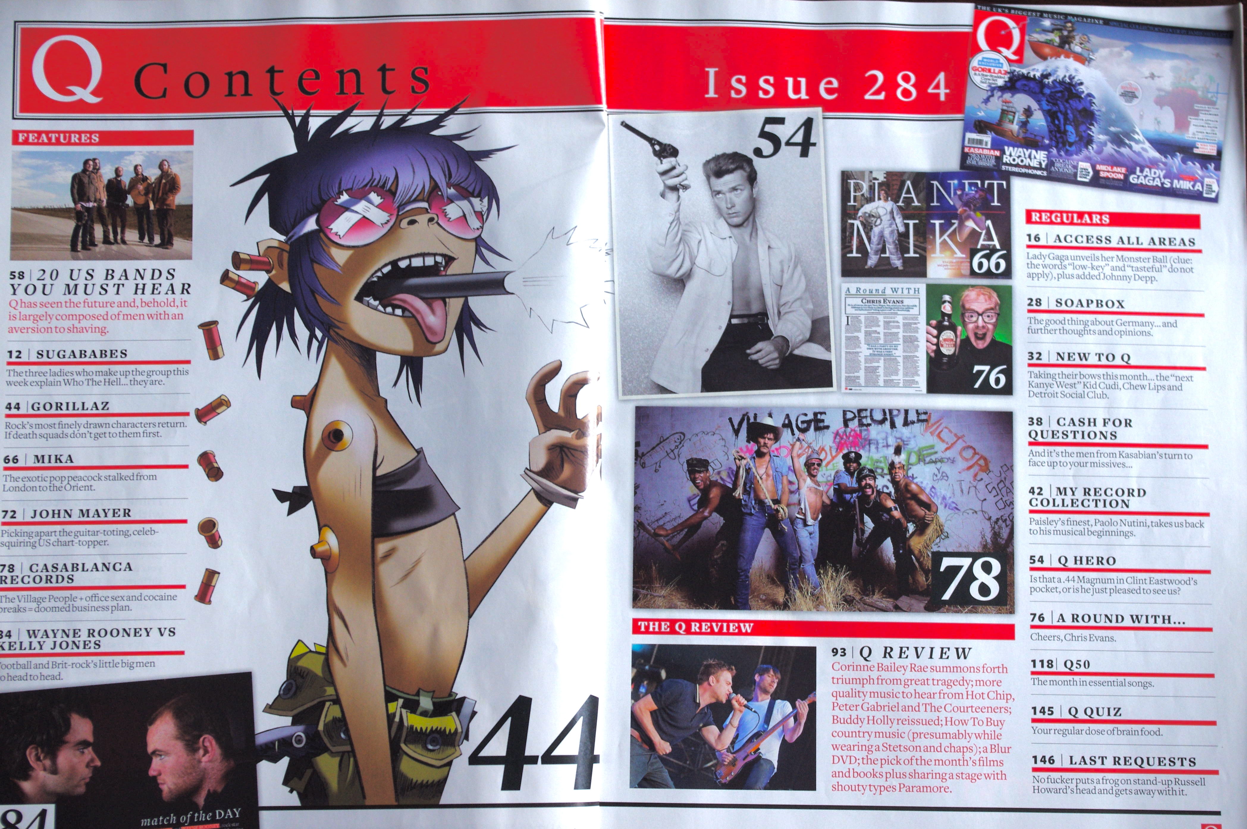
This contents page looks very professional. It has lots of images, meaning lots of news and information, too. Images of different conventions (bands, movies,talk shows, films) are all in one page. Images are a short way of putting messages all into a short amount of space.
This contents page has a unique layout. As you can see, the image overlaps onto the other page, yet still not ending. Information is also all into one page, where the majority of the space is taken by the image. This just makes the page seem more appealing and attracts attention. Color schemes are also very organised - there is a mix of black and white, specifically for the text in order to make it more visible. Other things to note is also the date - the date is written in bold letters, along with a contrasting background colour to emphasize and bring it out more.


No comments:
Post a Comment